Dreamwork’s new film How to Train Your Dragon has not been on top of my years must see films. The films coming out of the studio (since the original Shrek, which I wont hear a word against!) have been generic, formulaic and, lets be honest here, designed with merchandising very much in mind!
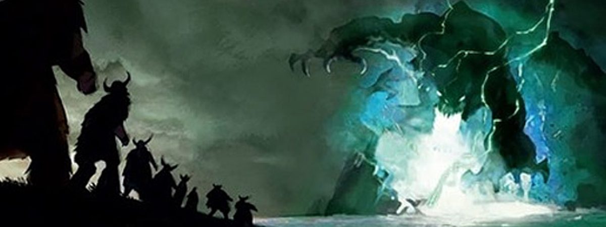
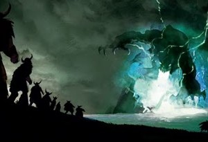
The trailers haven’t done a huge amount of improve my opinion of the film (although I have read some very good reviews), but yesterday I came across this concept art which shows where the film came from visually. I’ve always absolutely loved dragons and fantasy art, and this is no exception. It looks like at one point it was going to be a really dark, moody piece with atmosphere and drama.
I don’t want to judge the film before I’ve even seen it, but comparing this beautiful concept art with the images of the finished film screams to me that someone somewhere took a very wrong turn!!


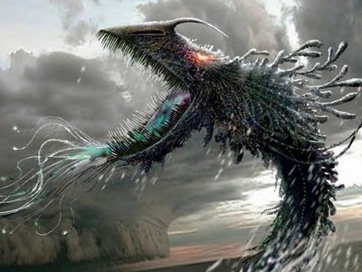
… and how it turned out. Very happy meal friendly!
